Client: Berneda S.A
Awards:
MUNICH Arena Store, Valencia
An immersion into a white fractal Arena
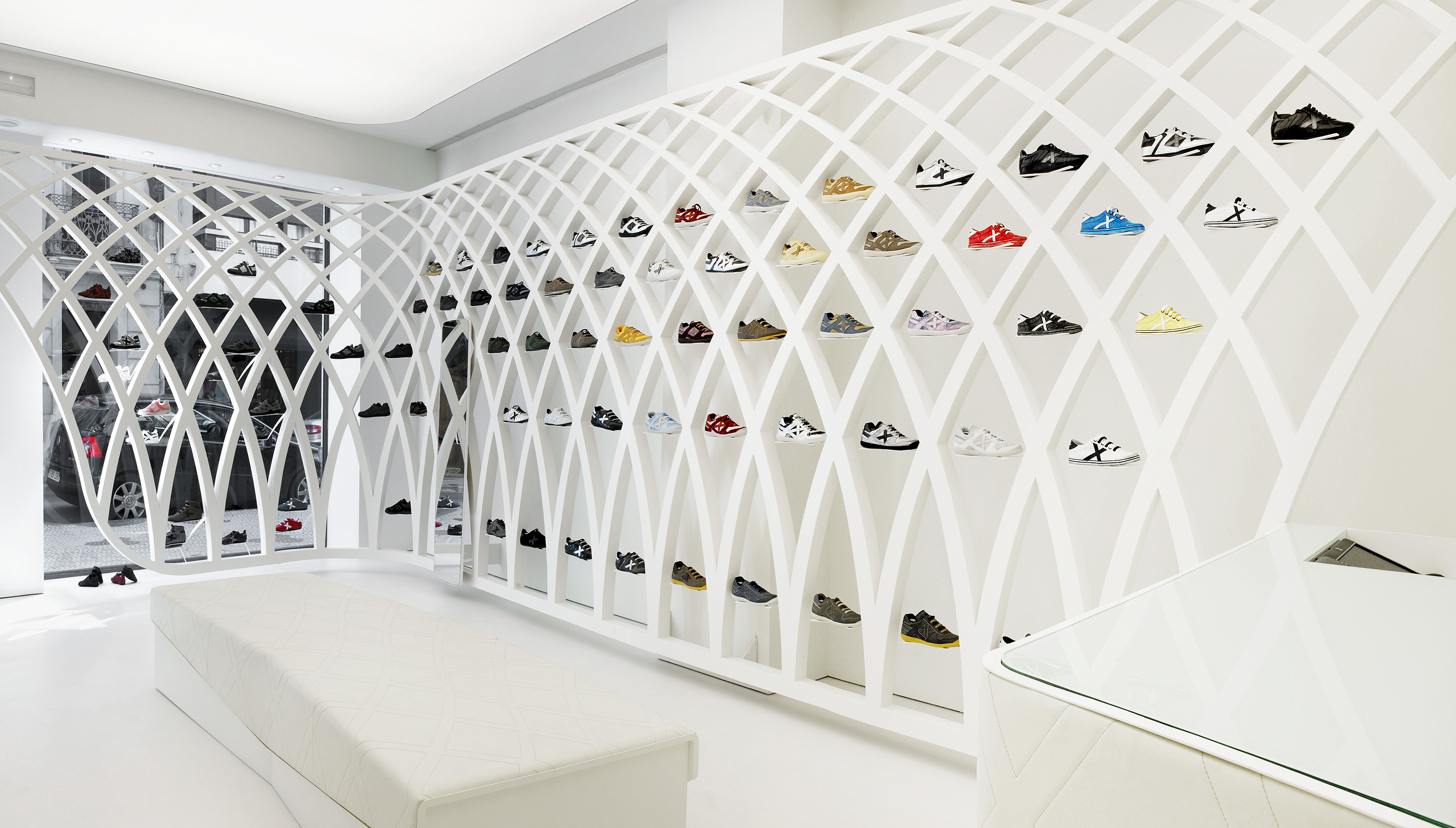
Munich, the fashion and sports footwear firm, opened its second store in Valencia. deardesign conceived a light, neutral and open space to exhibit the brand’s shoes. The main idea is to immerse visitors in a fractal Arena (understood as a stadium), a space flooded with light framed by a hanging metal structure.
Visitors enter the store from the street and transport themselves from the chaos into a futuristic lab environment.

There is no differentiation between display window and display furniture, as it is all combined in one only piece that spreads throughout the walls of the space.
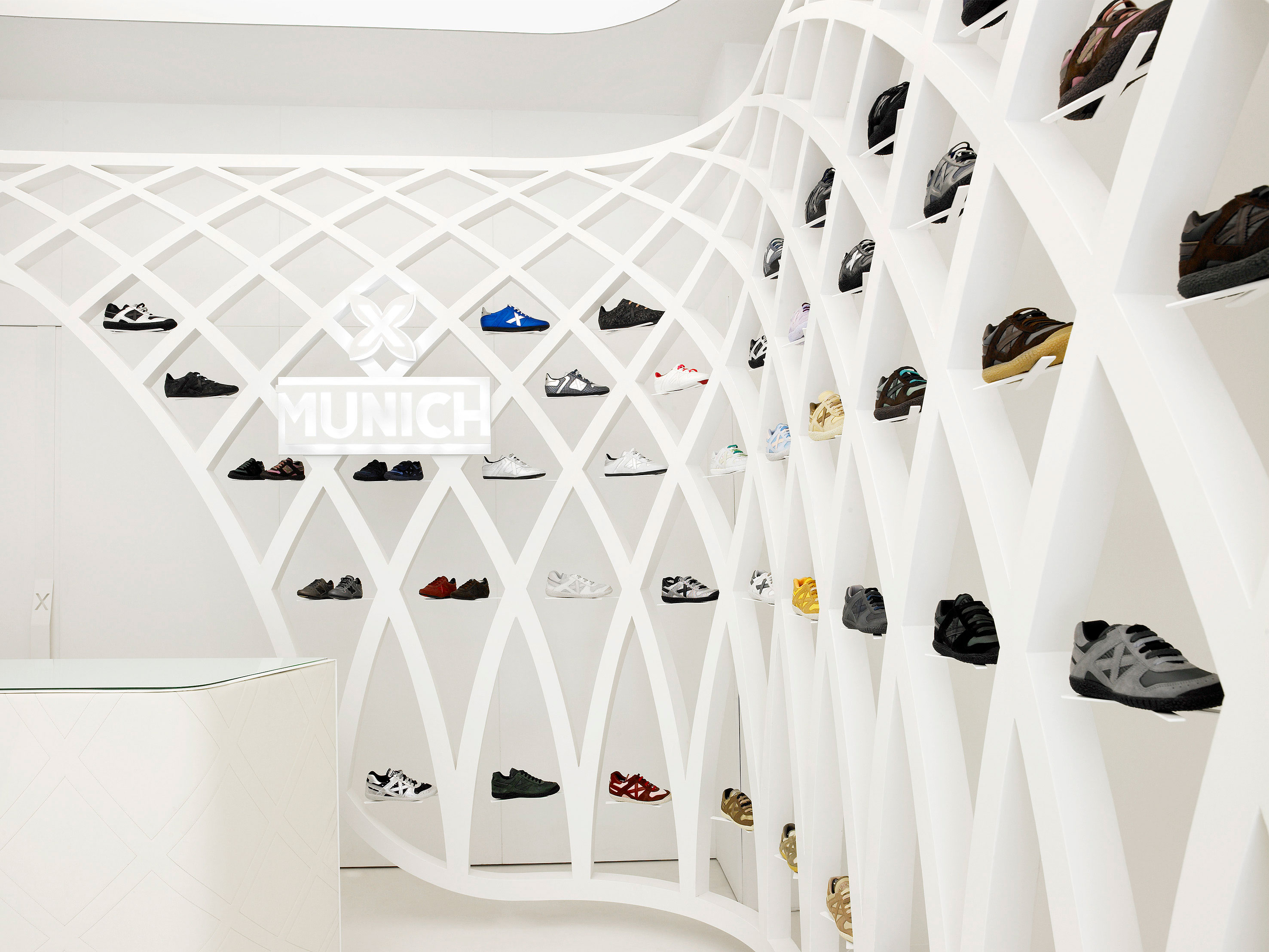
The Arena is shaped by the metal structure, a second skin that surrounds the existing container without touching it and also serves to exhibit the shoes,
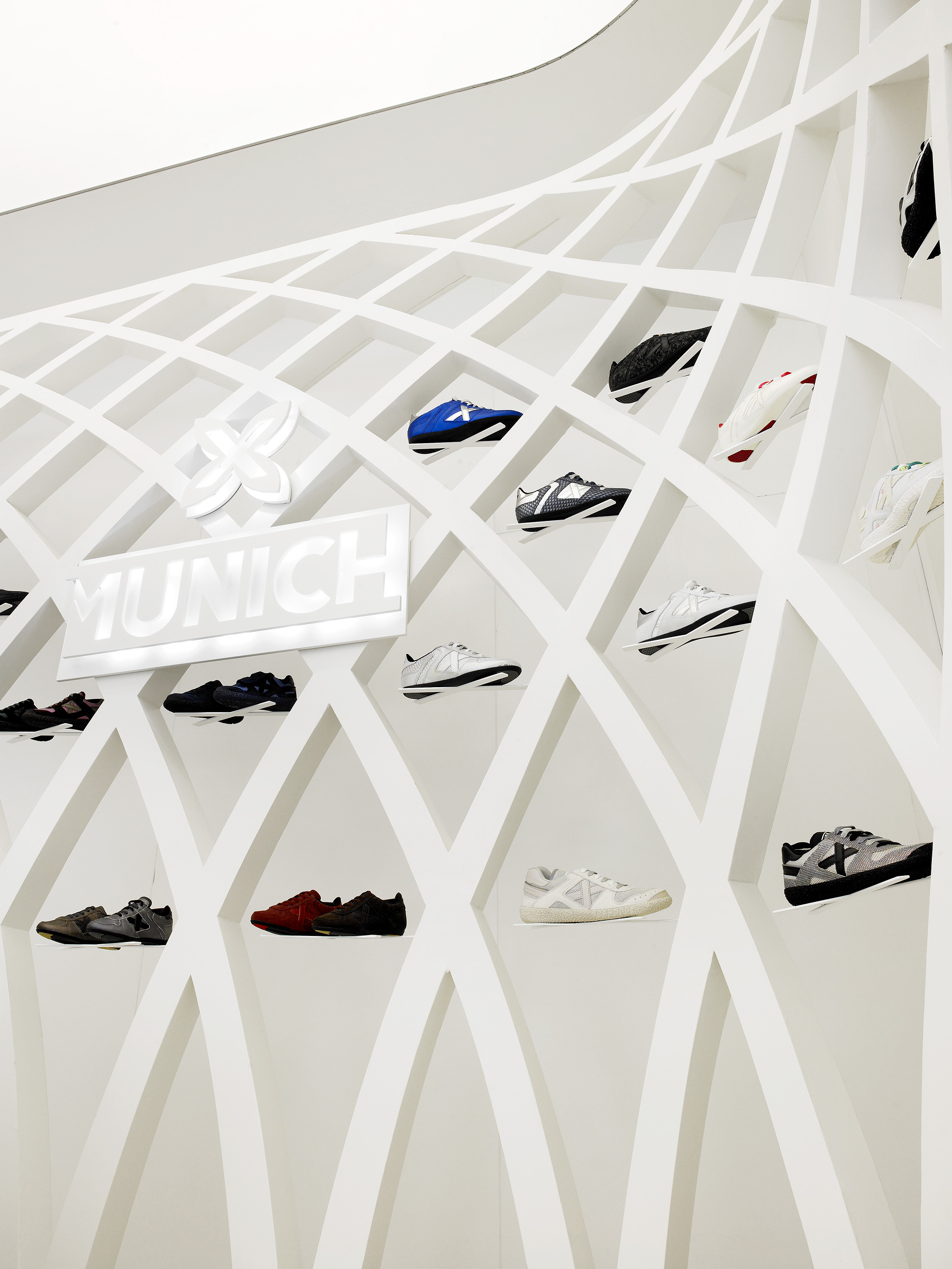
suspended creating an effect as if they were floating.

The structure’s fractal design is based on the X brand’s symbol, repeated infinitely, down to the last detail: the supports, the backstitching on the skin on the bench and the counter, and the system of catches – always performing different functions.
Through the holes in the structure the shoes can be reached very easily, highlighted by the use of white.
The simplicity of this project lies in saving materials – only sheets of glossy white lacquered iron for the perimeter structure, Corian for the lettering, a Barrisol stretched ceiling for lighting, natural iron for the joinery, white polyurethane resin with glossy varnished finish for the floor, and white skin and iron sheets for the furniture.


