Client: Oficinas Matias Massó S.A
M+O Offices, Barcelona
Communicating vessels.
“In a set of containers containing a homogeneous fluid: when the liquid settles, it balances out to the same level in all of the containers regardless of the shape and volume of the containers. If additional liquid is added to one vessel, the liquid will again find a new equal level in all the connected vessels.”

From that idea we created the project of M+O offices, adapting the behaviour of the communicating vessels to the customer needs to implement the company’s philosophy: to potentiate teamwork. To meet the goal, we identified three important values in M+O’s way of working as a guidance for the project:
Space functionality
to eliminate the physical barriers generated by the independent offices and therefore the lack of communication between departments. The space needed to be open.
Hierarchies disappear
when eliminating personal offices, physical hierarchies got eliminated as well. Everyone has to work within a same open space,
allowing a better accessibility to the different management and employee levels of the company. The communication becomes therefore more fluid.
Paperless office
this new green concept makes paper disappear as a physical element, the only documents generated are electronic. The practical office and kind with the work environment is born, optimising to the most the squared meters.
By this way, the space settings of the new M+O offices were set as diaphanous. And it was divided in four different and well defined areas according to the internal ways of working of the company.
Area 1. Show Room.
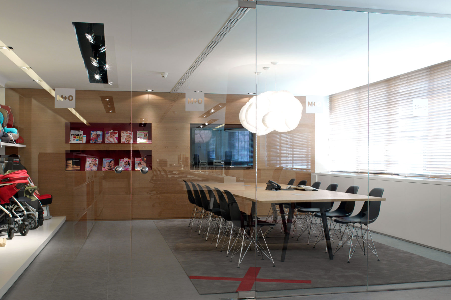
It is the most public part and representative of M+O brand. It turns into a total digitised space which is used at the same time as a
meeting room with customers and sales associates and also as a showroom itself. The plasma TV screen can be controlled from the main table, it also has Wi-Fi connection for the product demonstrations, it is possible to have video calls etc.
Area 2. Informal meeting room.
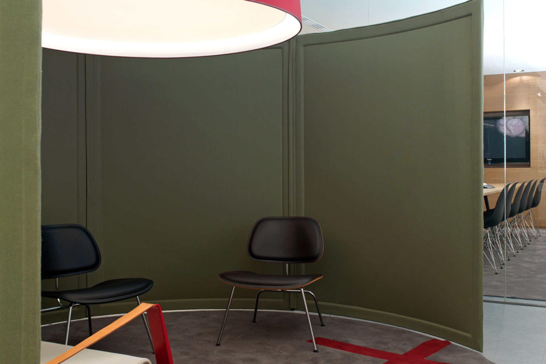
The informal meeting room was conceived as an island, a refuge, where the employees could chill out, to isolate from the
office activity. A screen was designed with a soundproof and isolating fabric, and a ceiling lamp overdimensioned, in order to reduce the ceiling and to potentiate the feeling of change of space.
Area 3. Reception area without receptionist.
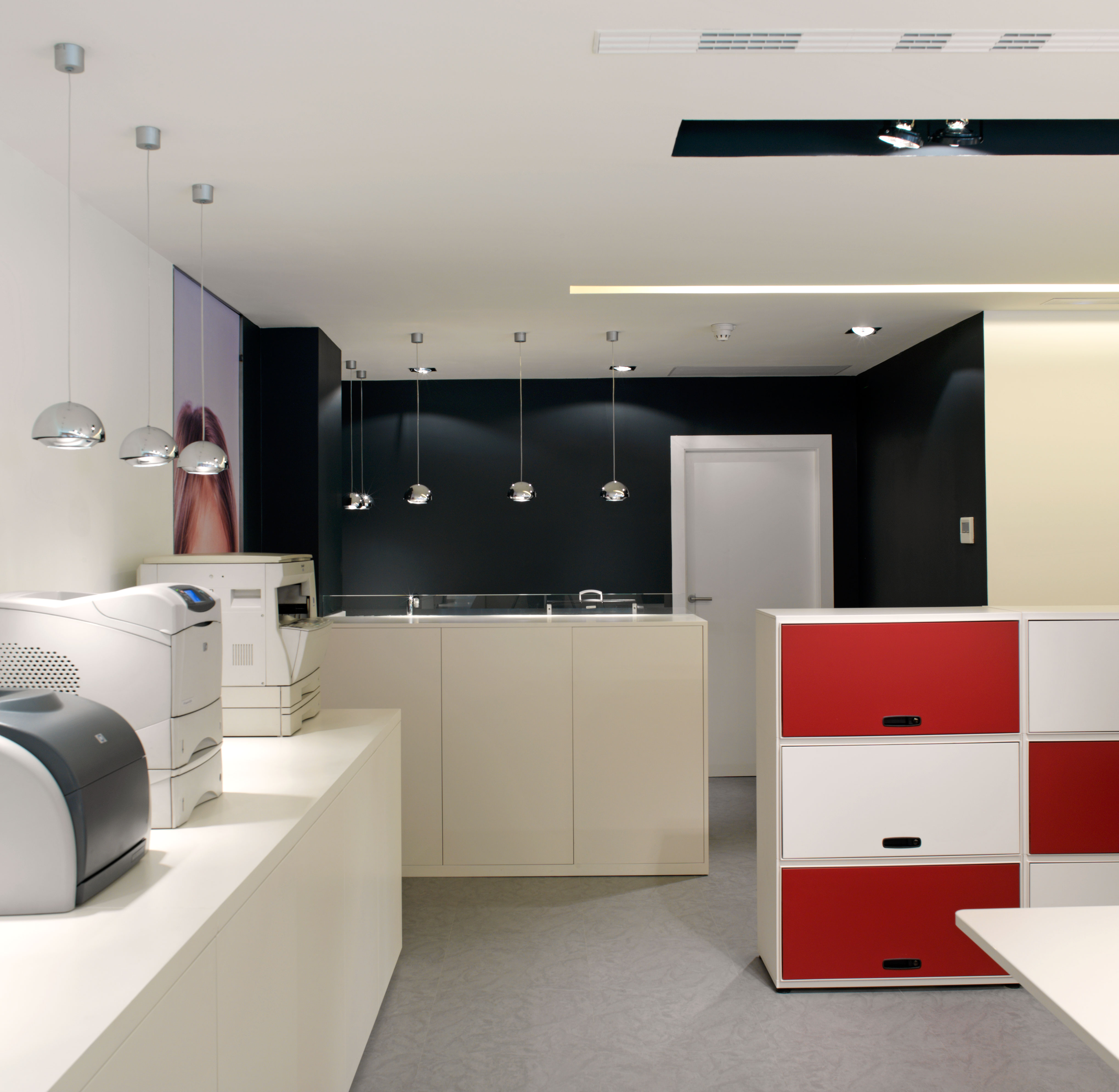
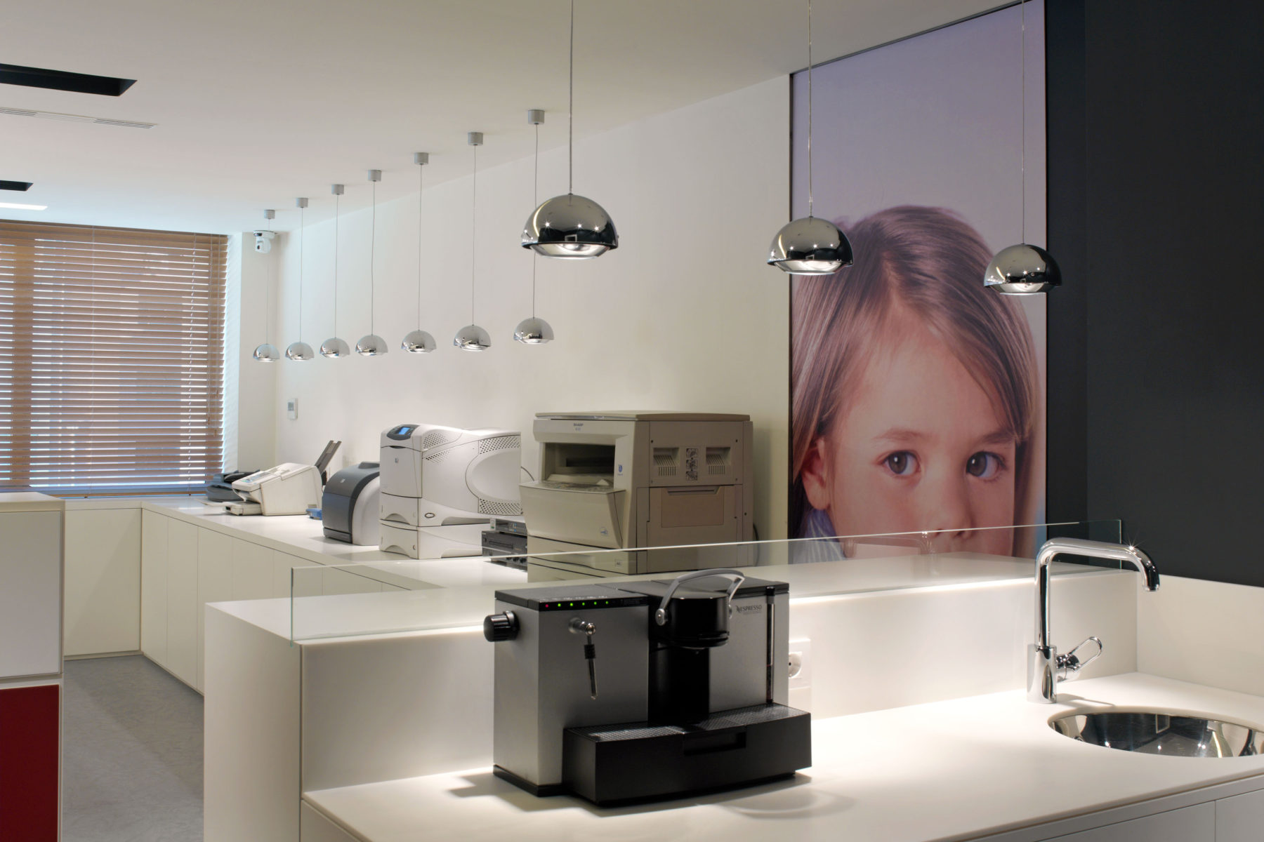
From all work places the office access is seen through a camera, then it will be only the person to whom the parcel is delivered or is waiting for a visit the one who will take over. A tailored piece of furniture made of Corian divides the entrance hall and the space of work. It works at the same time as a container and support to place the company logo backlit.
Area 4. Teamwork.
With no distinction amongst managers, directors, employees nor salespeople. Reinforcing the idea with a single desk with a length of 11 meters, where 8 comfortable work places get joined, to optimise the constant communication between all. The perimetral storage is used to keep the documents from past years.

Materials used.
The simplicity and sobriety of materials used, mashed fabrics, corian, texturised oak, gives to the space an up-to- date and timeless look which connects perfectly with the usage of the design classics.
Also, the homey look makes the employee feel as comfortable as possible, because we don’t have to forget that we spend the majority of our time at the workspace, so our responsibility as designers is to provide the maximum of comfort and wellness to our lives.


