Client: Lurdes Bergara
thecoolhunter.net
LURDES BERGADA & SYNGMAN CUCALA Store, L’illa Diagonal Barcelona
A vanguardist contrast of light, pure and technical materials
Contrast is the main concept for the creation of the new flagship store from Lurdes Bergada, Syngman Cucala, at one of the best shopping centers of Barcelona, l’Illa Diagonal. Keeping our challenge of exploring to find a new language, we search for new ways to refresh the universe of retail and the existing architecture codes.
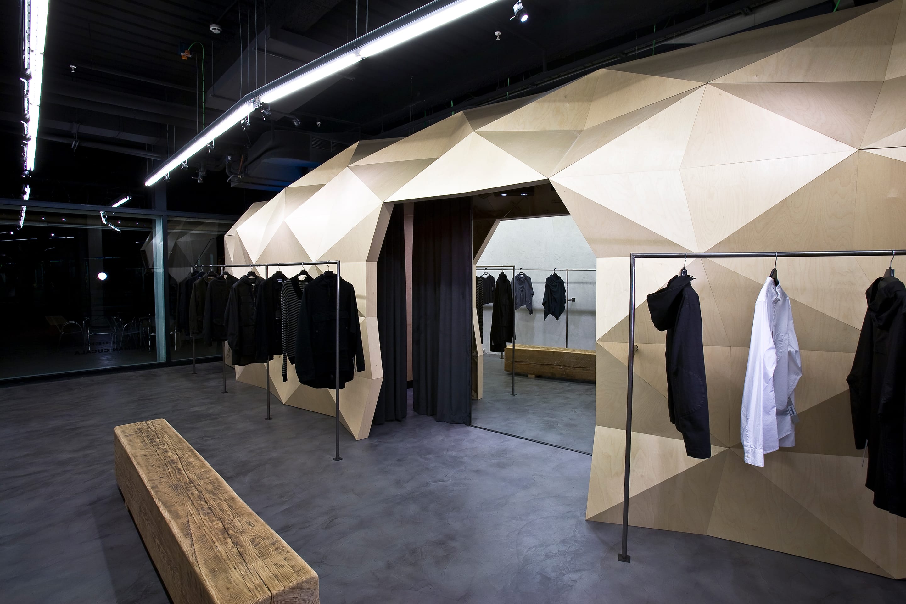
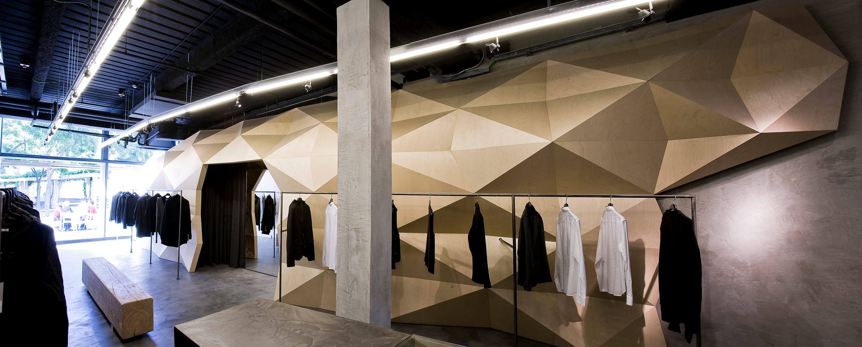
There are two clearly defined areas which allows, on one side, to reunite all technical aspects of a clothing store behind a wooden ‘skin’ and, on the other, gives the main focus to the exhibited pieces.
The project seeks to preserve the shared guidelines in all Lurdes and Syngman’s existing stores: industrial, different, minimalistic, adding a contemporary touch in its architecture.
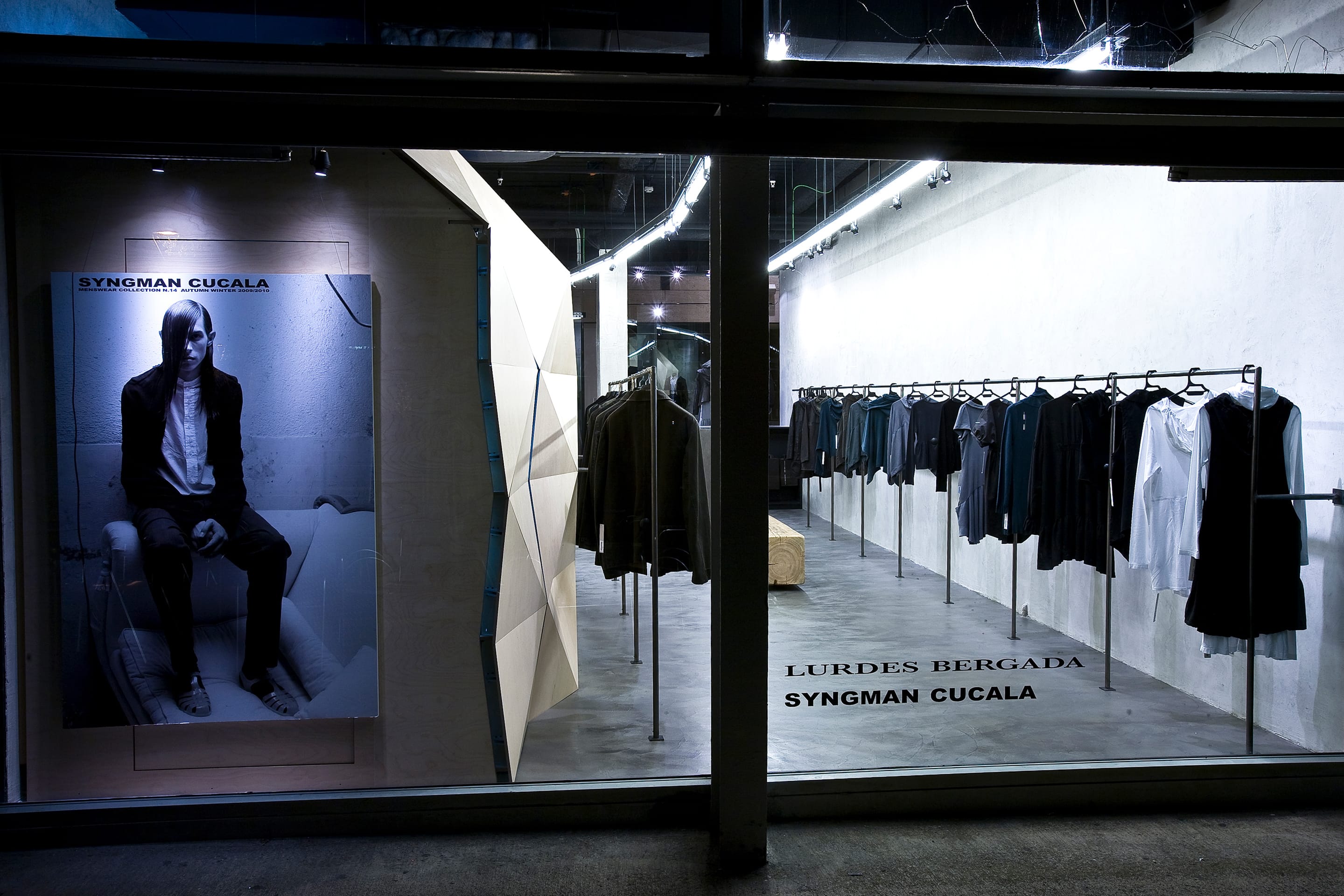
The main idea was to give to the space a view over the shopping mall’s park. By this way customers will have the sensation of shopping in a street store. So we apply the inner concept of l’Illa Diagonal, which understands the act of shopping in a mall as if it was in a commercial street. Therefore, the park gets into the store and becomes part of it, as an additional decorative element.
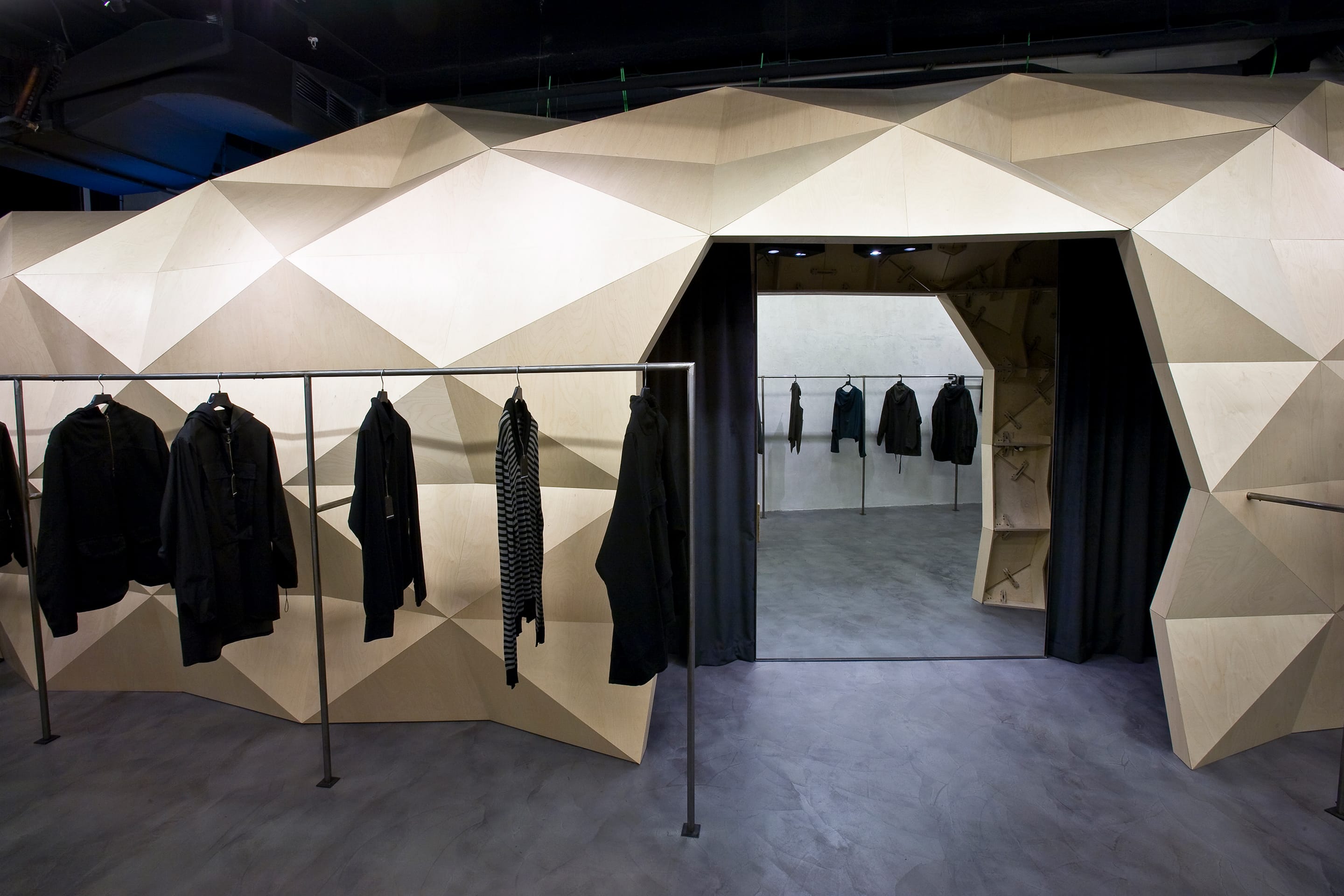
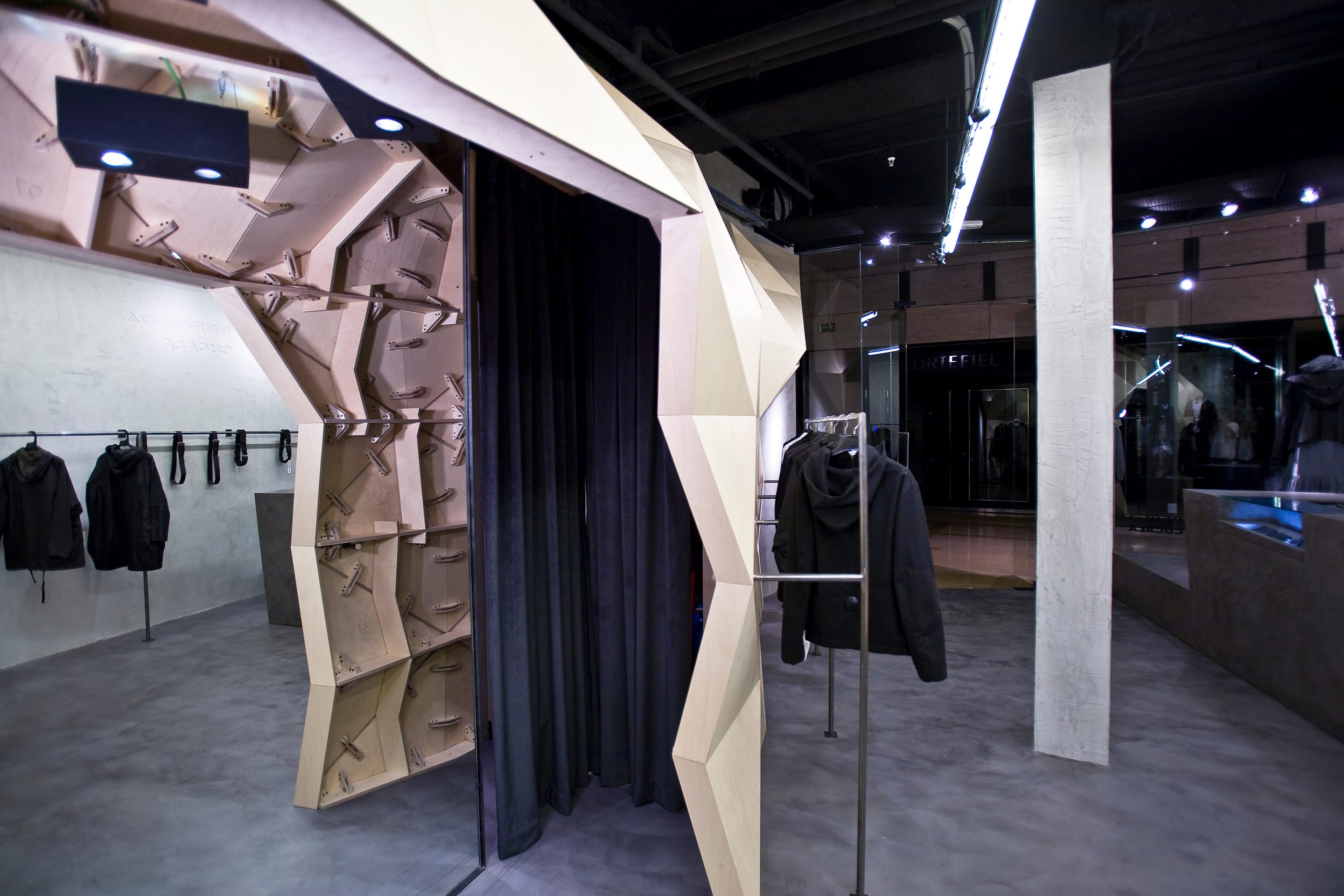
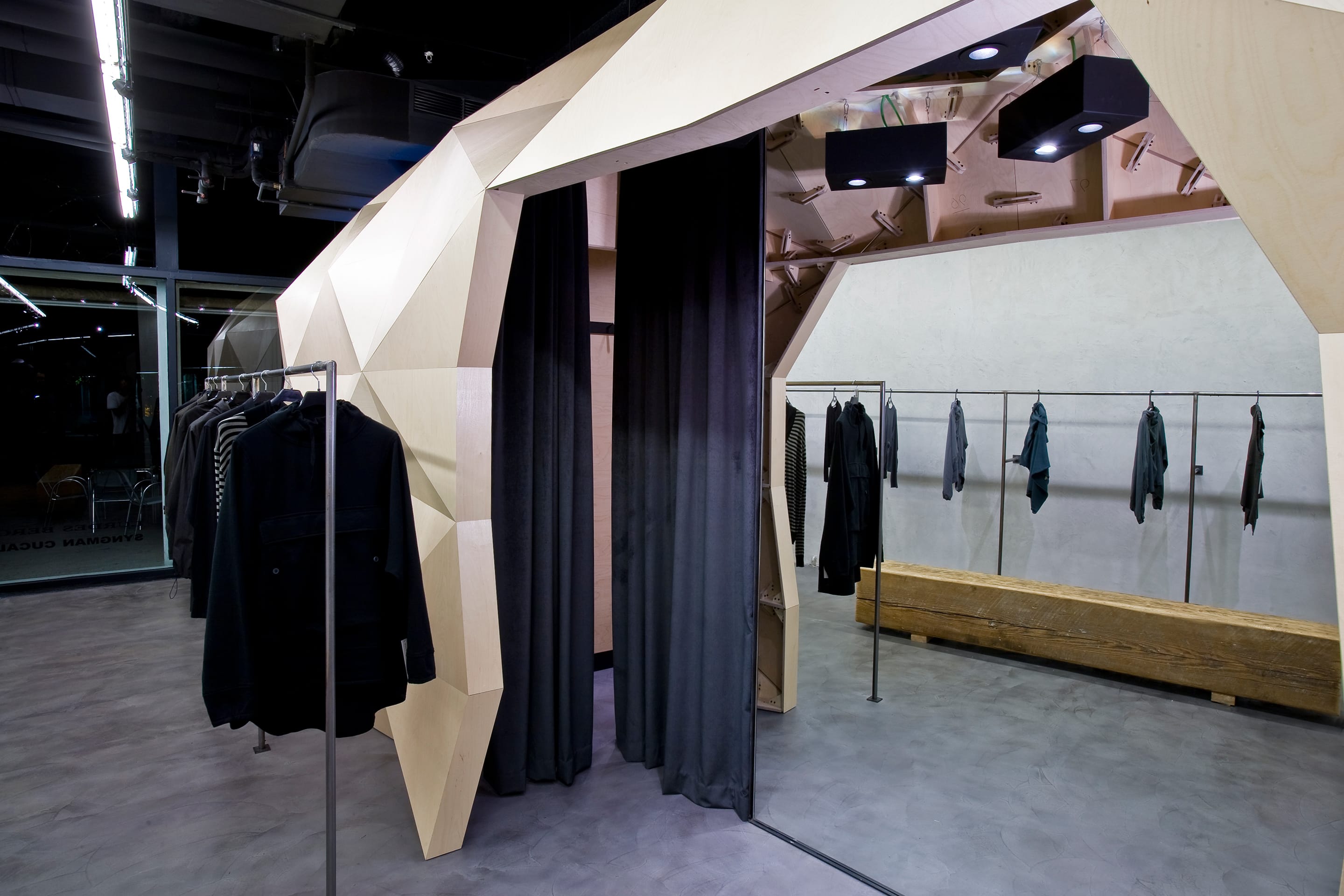
From the park, the back façade attracts in the same commercial way as the interior façade of the shopping centre does. We decided to put together all the store technical functions: storage, fitting rooms, electrical equipment, and a second small window, in order to hide them behind a unique wood structure made of 1.000 pieces. The wooden skin allows all large structures to be hidden at the upper part, so the ceiling stays clean.
Inside the ‘skin’ the building secret gets revealed.
An extremely technical space, which reminds the reverse of fabrics, with its sewing, stitching, etc… to reflect the real importance of technicity in clothes making and reinforcing the brand values: simplicity, pureness, and industry.
The installation made of irregular triangles reminds of a rich, a contemporary cave. The natural beechwood stands in contrast with the opposite wall, made of visible concrete, plain and cold. Each drawn piece is unique and numbered to make it easier during the building process.
Most existing stores of the brand preserve traces of the history of the buildings where they are located. Then, the aim of the project was to respect as much as possible the original context of the place, to reinforce the industrial spirit of the building. Basic materials such as concrete for the walls and fine cement on the floor are used. The small quantity of materials helps to simplify the arquitectural reading of the store and to strengthen the design concept.

The natural light of the park combined with the one in the store plays with reliefs, creating shadows and highlighting the volumes. There are three kinds of indoor lighting united by a lineal element: the fluorescence makes ambient light, and the dichroic and halogen enlighten the items highlighting its volume. The lighting light which goes from side to side strengthens the perspective chasing the side volume.
