Client: Grup Bou
GRUP BOU copy center, Tarragona
Transforming a traditional business into an avant-garde showroom
Copisteria Bou is a printing and graphic arts business located in the center of Tarragona, with a large history since 1980.

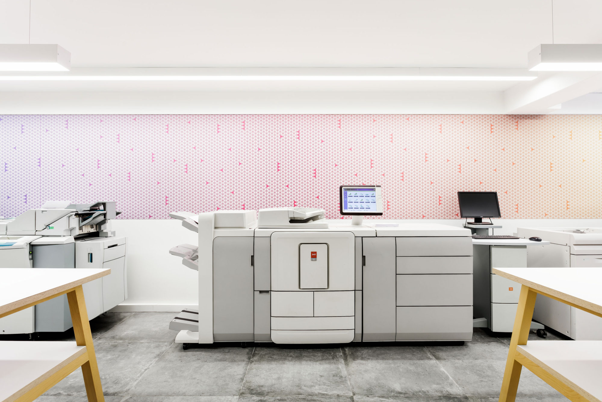
The space is divided in two different areas with separate entrances according to the kind of service and public addressed: the end-customer selling zone and the reserved area for professionals only.
deardesign had the mission of conceiving an interior design project which updated the layout of the shop and also could enhance the experience of the visitors but also of the employees. Optimising the separation between the two spaces according to the services offered in order to facilitate a better customer care. One of our challenges was to help to communicate some of the services offered at the business through the own space materials on a very visible way. The most important guideline was to get to be able to organise all the elements, spatial and selling ones, on a clear, organised and efficient way in order to generate a very good visual impression to convert into a sale afterwards.
The main objective was to optimise the end-customer area where to make transit easier and gain efficiency, and at the same time to potentiate the professional area to transform it into a showroom where it would be possible to get a close and personalised treatment.
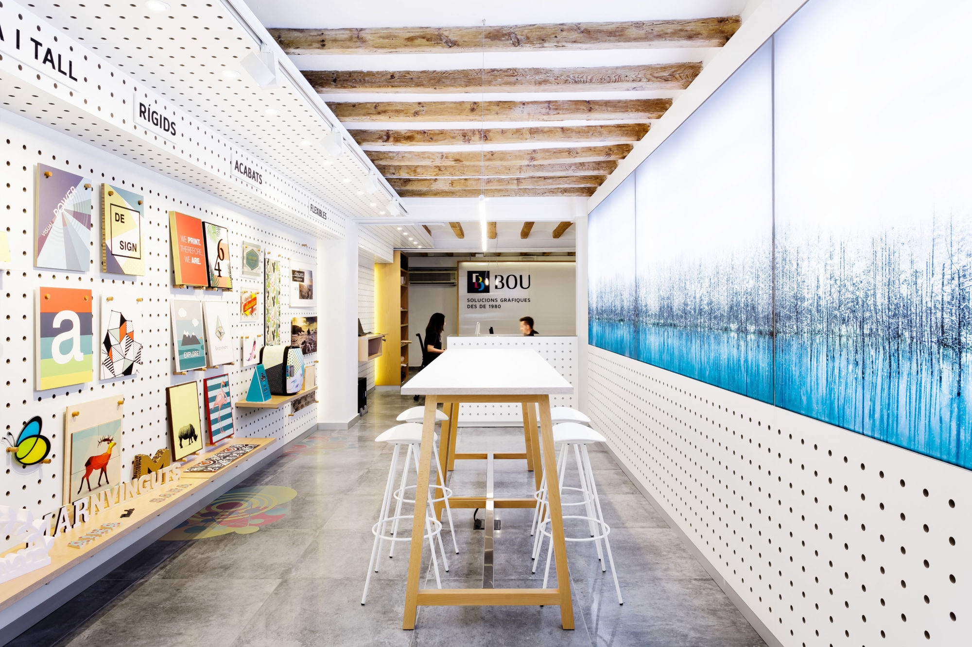
For that, the furniture distribution was altered. The counters, located at the first level formerly, were moved to the back so new high tables with stools were placed. By this way, a much more relaxed atmosphere was created and we eliminated the physical barriers of a typical daily business. So we reduced the feeling of being at a quick-selling place and then could emphasise the services oriented sales and the welfare sensation within the space.
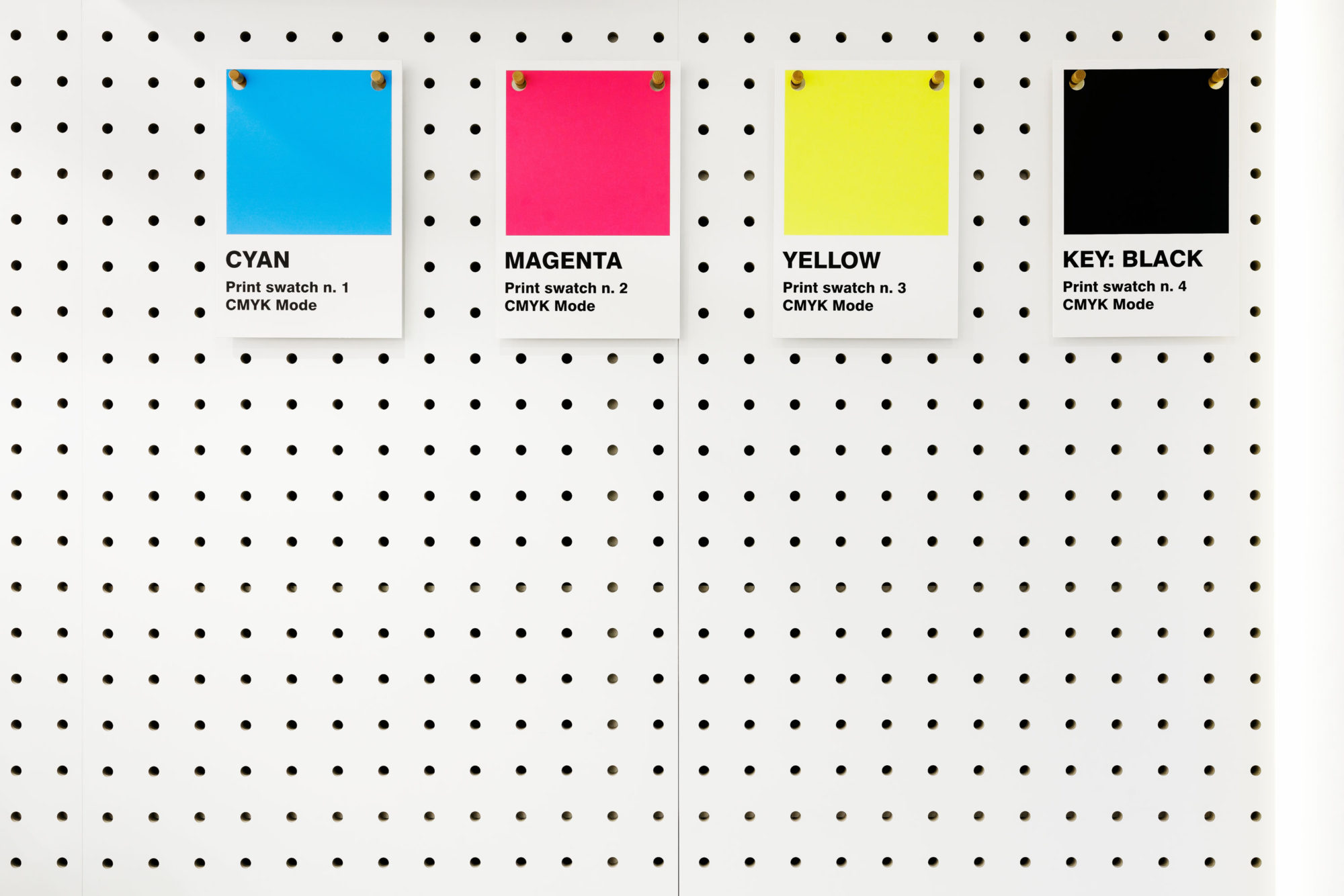
All the areas are covered at their perimeter by a grid which allows the maximum flexibility whether to present the services and displaying the selling items. The grid counts with a perforated system, so it is possible to exhibit on an organised, easy and clear way, all the new arrivals and also to change the exhibition according to the needs of each moment. So the disposition of the elements can be altered as for height and location without problems.
An image was also installed over the window and along all the space creating an interesting perspective; it is also a real proof of the possibilities of applications and its potential, also as for the aesthetics, of all the services offered at Bou’s. The image is backlit and also gets the light from outside.
The continuous image is held on magnets.
By this way the space can be transformed and adapting to the themes linked to every season, so it helps to enhance the change that the dynamism of the shop services require.


