Client: BSM – Pompeu Fabra University
Hall BSM – Pompeu Fabra University, Barcelona
Space connection and brand visibility
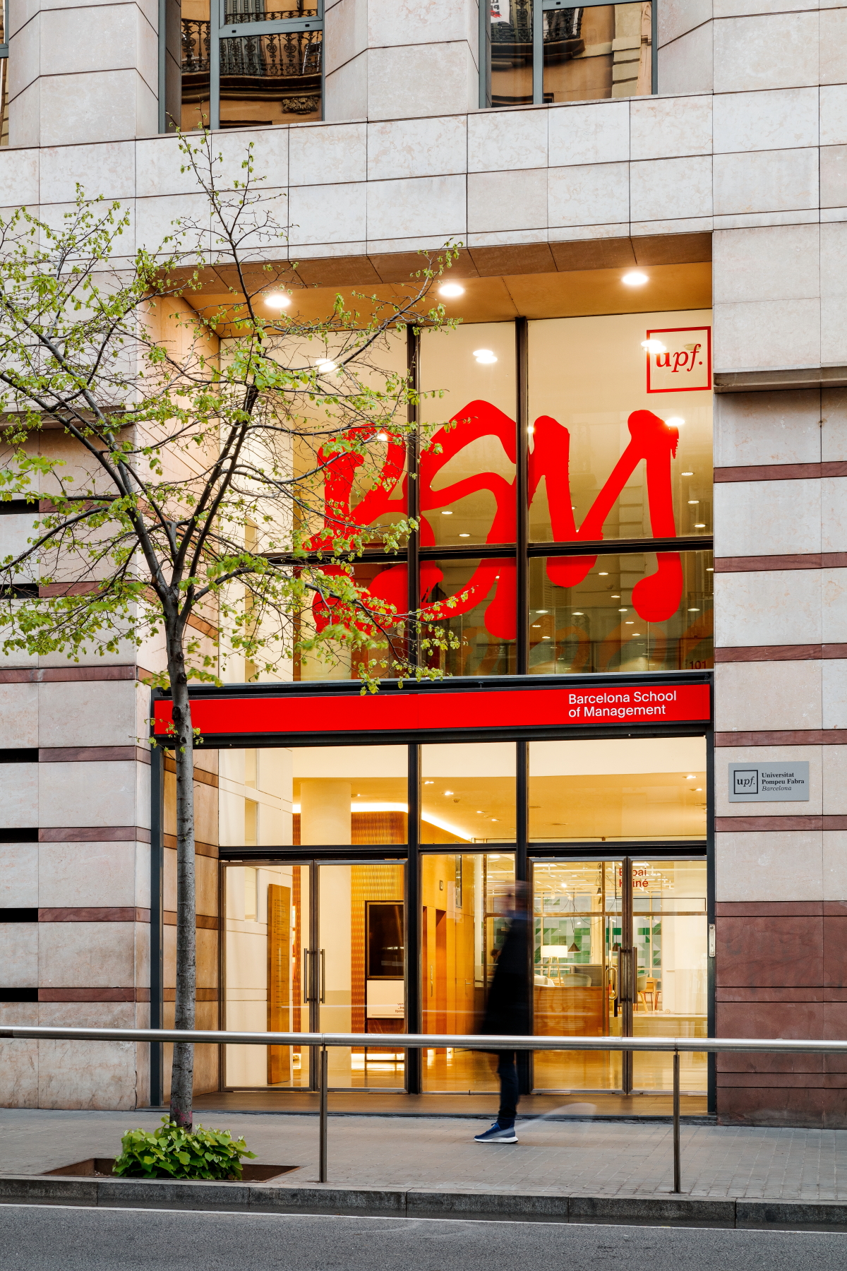
By highlighting the new educational model with a disruptive spirit, the BSM, Pompeu Fabra University’s school of management, has created a new brand with artistic and urban flair.
A new visual and spatial identity that connects with users, reflects the differential truths of the new model, stands out from the competition and allows its disruptive discourse.
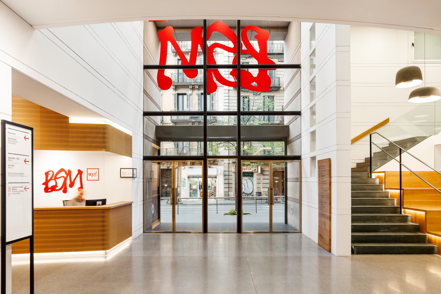
deardesign studio has created the Hall of the BSM, which imprints the new identity and helps the students to establish an interpersonal connection of collaboration with each other and with the school.
Previously, the main entrance was only used as an information and circulation space, with elevators as the only place to interact. All these spaces were a subject to the legacy of the 90s.
From the initial premises of the project, deardesign manages to revalue the current spaces with new uses and functionalities, capturing the new identity and thus generating new connections.
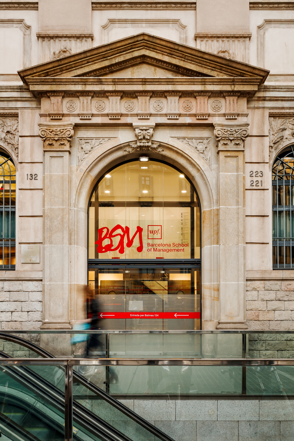
Entering BSM – UPF from Balmes street in Barcelona allows us to discover the reception, a nexus capable of establishing an interpersonal connection, collaboration between students, faculty and staff. It is the starting point to access other spaces.
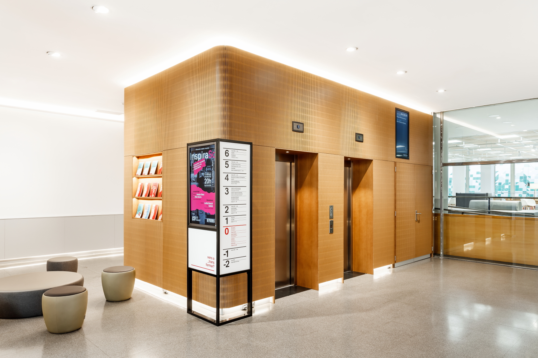
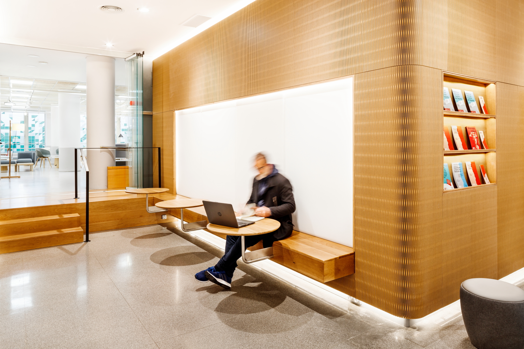
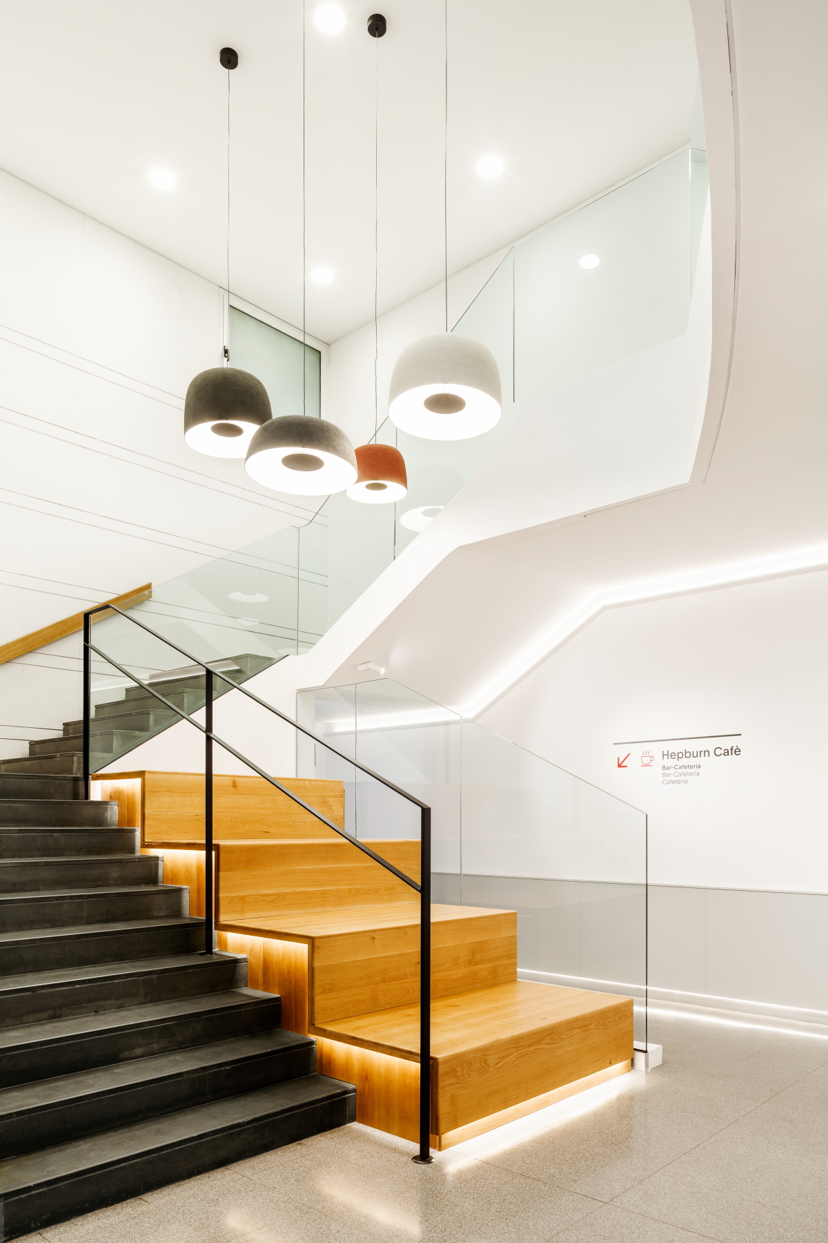
In the same entrance area, around the volume of the elevators, we find social spaces, where the meeting and unexpected connections are encouraged, for example: the set of textile poufs in front of the catalog area, the wooden bleachers located on the staircase or the informal ‘Meeting-point’ area with a bench and suspended tables.
On the other hand, the reception space connects directly with the Koiné Space (project previously developed by deardesign studio), with the Auditorium and the Léxia Room (recording and representation space) through the circulation corridor of the two buildings.
The main idea that led to the new design was to get more out of the useful space and giving it a more welcoming, dynamic, active, bright, and comfortable air, thus transmitting the sensation of feeling at home.
In order to extrapolate the new visual identity, optimize and implement in the spaces, the signage and its uses were improved.
deardesign studio creates fixed / mobile structures and flexible elements made to implement framed posters and screens in an orderly, clear and intuitive (informative signage, information occasions, events, displays) way.
Wylma Blein carries out the design of the graphics of the new signage, and applies the new BSM logo by Federic Amat.
Likewise, the materials emphasize the new identity:
- glass elements with corporate colors
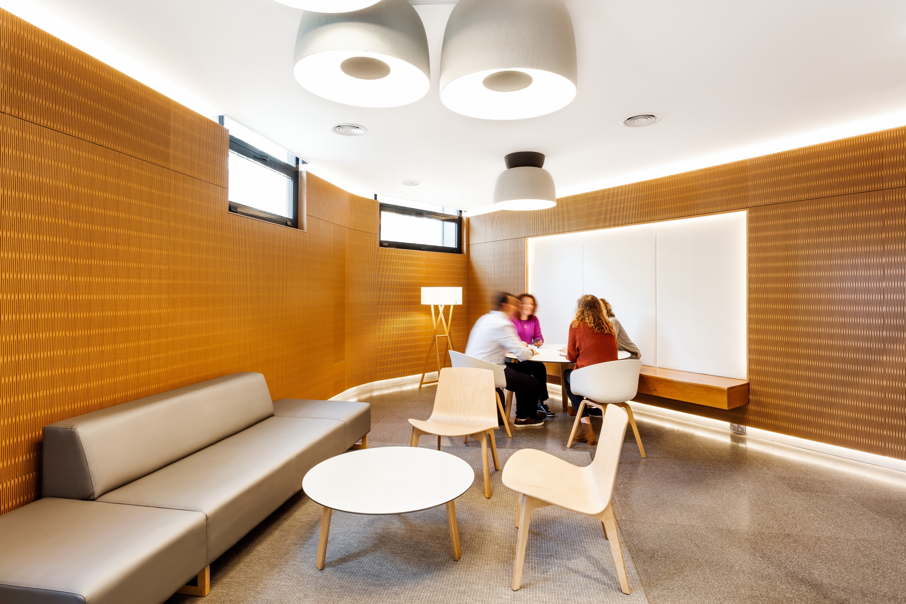
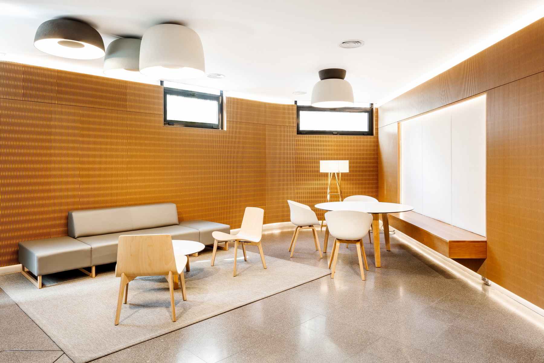
- the flexible wood Dukta to give warmth (varnished MDF plywood)
- solid varnished Oak wood to give comfort
- textile elements to rejuvenate the space and make it more technically acoustic.
In terms of lighting, we changed the existing ones with a warmer adjustable LED lights. Additionally, we added the indirect linear lighting in walls, floor and ceiling, to enhance the materials and create a wrapping layer, more pleasant and luminous environment that invites us to enter.
Thanks to this new design, it has been possible to achieve the goal of creating a new concept of space, with a dynamic and lively environment, which places value on creation, culture and transformation.
